import matplotlib.pyplot as plt7 Matplotlib
Matplotlib is a widely used plotting library in Python that allows you to create a variety of static, animated, and interactive visualizations. It’s especially popular for creating plots and graphs to visualize data, making it an essential tool for data analysis, data science, and machine learning.
7.1 Import Matplotlib
7.2 Example plot
Code
import matplotlib.pyplot as plt

# Example data
x = [1, 2, 3, 4, 5]
y = [10, 20, 25, 40, 55]

# Create a simple line plot
plt.plot(x, y)

# Add titles and labels
plt.title('Sample Plot')
plt.xlabel('X-axis Label')
plt.ylabel('Y-axis Label')

# Show the plot
plt.show()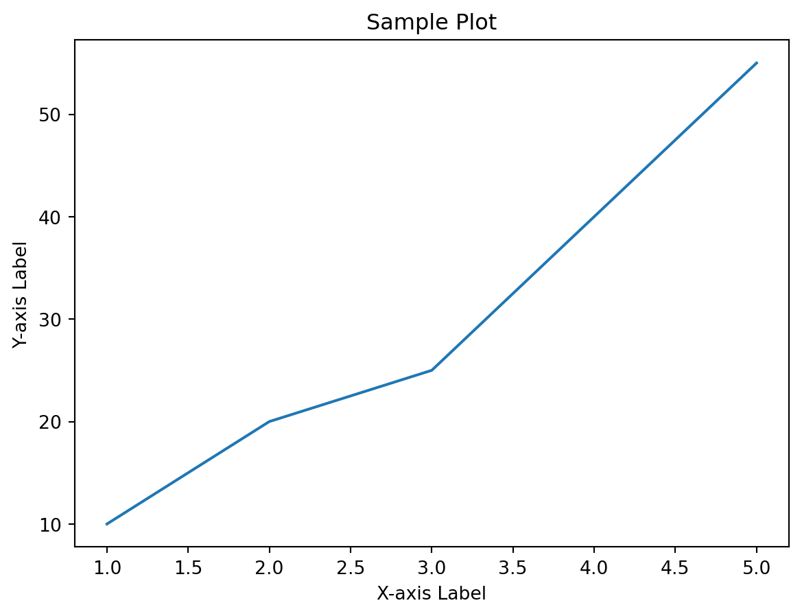
7.3 Integration with Pandas
Code
import pandas as pd
import matplotlib.pyplot as plt

# Example DataFrame
data = {'A': [1, 2, 3, 4], 'B': [10, 20, 25, 30]}
df = pd.DataFrame(data)

# Line plot using DataFrame
df.plot(kind='line')
plt.show()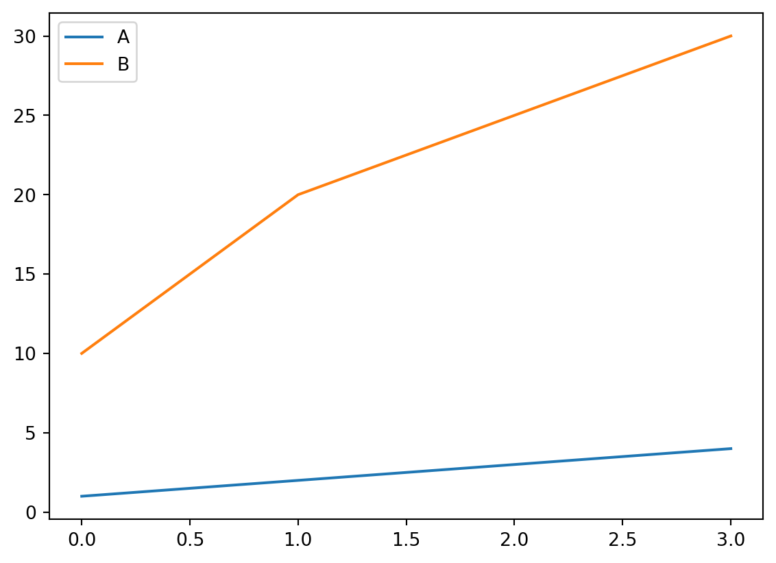
7.4 Scatterplot
Code
import matplotlib.pyplot as plt

# Data for the scatter plot
x = [1, 2, 3, 4, 5]
y = [10, 20, 25, 40, 55]

# Creating the scatter plot
plt.scatter(x, y)

# Adding labels and title
plt.xlabel('X-axis')
plt.ylabel('Y-axis')
plt.title('Scatter Plot of Y vs X')

# Displaying the plot
plt.show()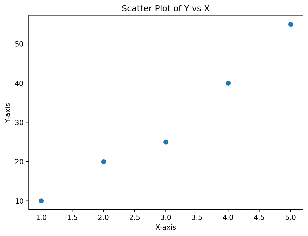
7.5 Color or colour?
Code
import matplotlib.pyplot as plt

# Data for the scatter plot
x = [1, 2, 3, 4, 5]
y = [10, 20, 25, 40, 55]

# Creating the scatter plot
plt.scatter(x, y, color='orange')

# Adding labels and title
plt.xlabel('X-axis')
plt.ylabel('Y-axis')
plt.title('Scatter Plot of Y vs X')

# Displaying the plot
plt.show()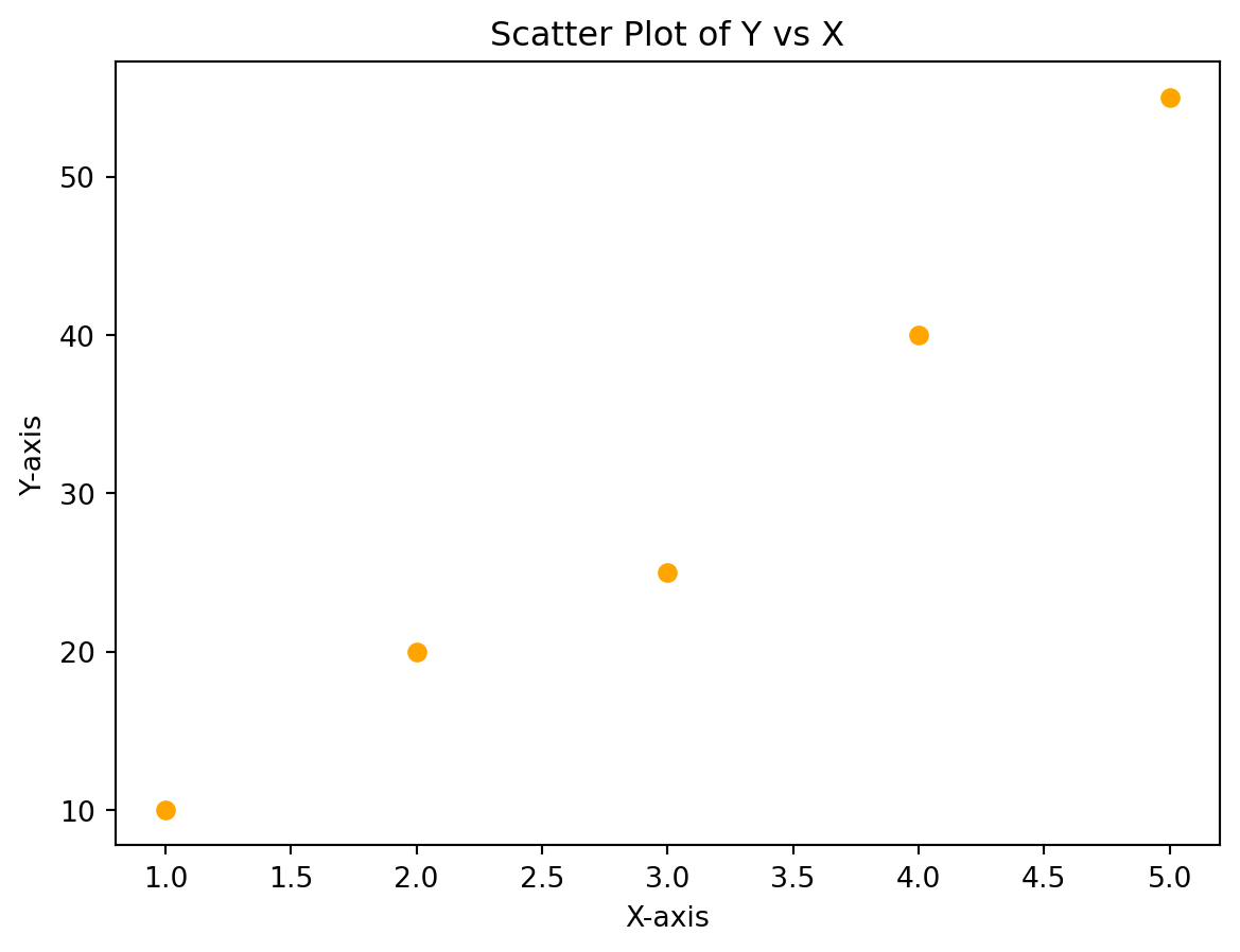
7.6 Exercises
Exercises
What is Matplotlib? How does it differ from pandas and numpy?
Why is it important to use plt.show() in a script?
What happens if your x and y lists are not the same length?
What’s the difference between plt.plot() and plt.scatter()?
Create a scatterplot using the following x and y values:
x = [1, 2, 3, 4, 5]
y = [5, 7, 4, 6, 8]
Add a title to your plot and label the x and y axes. What functions do you need to use?
Harry tries to follow the previous instructions, but his code does not run. How can it be fixed?
plt.scatter(x, y)
plt.xlabel = "Index"
Change the color of the line to green and the scatter markers to purple. What arguments do you change?
What’s wrong with this code?
plt.plot(x, y, color=green)What happens if you forget to call plt.legend() after assigning labels?
Try changing the marker style of the scatterplot to ‘x’. What visual difference does this make?
Try changing the line style of the plotted line to a dashed line. What argument is required?
Save your plot as a PNG file named “combo_plot.png”. Where is this file stored?
Try plotting only the first three points from x and y. What happens if you don’t adjust y2 accordingly?
What does changing figsize do? Make your figure’s width 10 and the height 6.
Change the line width to six. How does this affect the visualization?
Restrict the x values to between 0 and 6, and the y to between 4 and 10.
Modify the scatterplot above to include a second line, y2 = [4, 6, 5, 7, 9]. How does this change your code? What parameters help distinguish the lines?
Why does this code produce a ValueError?
plt.plot([1, 2, 3], [4, 5])- You’re trying to title your plot so viewers understand what the chart shows, but your code isn’t working:
plt.plot(x, y)
plt.title = "My Chart"
plt.show()
What’s wrong with this code and how can you fix it?